You asked
How should I prepare packaging artwork for print?
Imagine your designer has finished the carton artwork. Then the box size changes. Now the barcode sits on a fold and the logo crosses a seam. The best print projects begin with the package, not the artwork.
The quick answer
Approve the package and material before artwork, then use the right dieline, proof and finish for production.
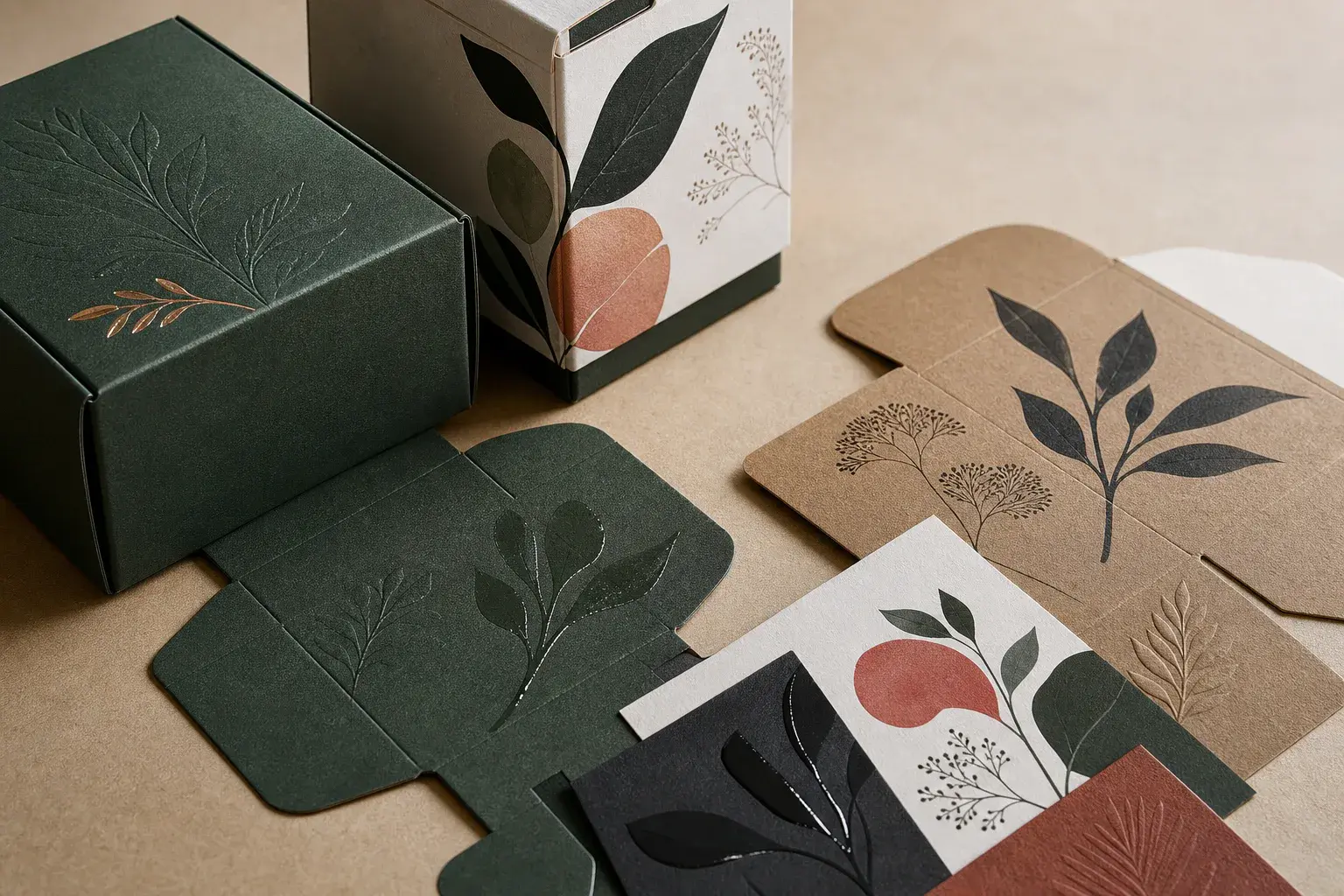
What we would ask next
Approve the box before designing the box
If you were sitting with us, we would ask for the final dieline and material before opening the artwork file.
Check the dieline date
A common mistake is using an old dieline because it looks close enough. Check dimensions, panels, glue areas, seams, folds, cut lines and bleed. Confirm the revision. Keep structural lines on a non-printing layer. Place important words where they stay visible after folding and closing.
- Is this the current dieline?
- Where are the folds and seams?
- Is the bleed correct?
- Which panel faces the customer?
Design for the real material
The same green looks different on coated white board, kraft and corrugated liner. Base colour changes ink. Texture changes detail and solids. Ask for printed examples on similar material. If one colour must be close, agree on how to check it and what variation is realistic.
What are you trying to confirm right now?
Common mistakes
Give the printer a file with no guessing
A clean file prevents small questions from becoming expensive press decisions.
Make every layer obvious
Use vector logos when possible. Supply or outline fonts as requested. Check small type, lines and reversed text before they disappear on press. Remove hidden objects and unused colours. Clearly name foil, varnish, white ink and emboss layers. The printer should know what prints and what does not.
Decide where colour must be close
Use images with enough resolution at final size. Follow the printer's colour setup. Do not approve colour from an ordinary screen. A digital value, coated swatch and ink on kraft differ. Show the printer a physical reference. Decide which colours need close control and where natural change is fine.
| Tool | Best for | Does not fully prove |
|---|---|---|
| PDF proof | Content and placement | Ink on material |
| Colour proof | Tonal expectation | Final structure |
| Folded prototype | Panels and form | Production colour |
| Finish sample | Gloss, foil or emboss | Complete pack unless specified |
If this were our project
Ask each proof one clear question
No single proof can confirm copy, colour, structure and finish perfectly.
Use a PDF to catch content mistakes
A PDF checks words, panel direction, barcodes and dieline position. It cannot promise ink on paper. View the whole package, then zoom into details. Have someone else compare the copy with the approved source. Record the approved proof number so an older file cannot return.
Use a physical sample for appearance
A colour proof, ink drawdown, press sample or prototype says more about colour and material. Each has limits. Ask what it proves. Fold it when possible because panels meet at corners. Review it under steady light and keep the approved sample for production.
What to do next
Use a finish for one good reason
Foil, gloss and embossing work best when they help the customer notice something important.
Know what each finish changes
Matte and gloss change light and scuffing. Spot UV adds local shine. Embossing raises or lowers the surface. Foil adds metal. Results depend on board, detail and folds. Keep fine effects away from scores. Ask how closely special layers can line up before making them touch.
Keep the approved sample
Put each finish on a clearly named layer with a legend. Use a physical sample to approve foil tone, shine or emboss depth. Confirm where coatings go and whether food contact or recovery limits them. Keep one signed pack with the artwork, dieline and finish details for the next run.
What we would check with you
Before we recommend anything
- Approve the current dieline
- Design for the real substrate
- Name special layers clearly
- Check type and barcode limits
- Choose proofs by decision
- Archive the signed production sample